source(paste0(pth, "/__scripts/helpers.R"))6 Evaluate accuracy of historical ESM projections
We need to evaluate whether our ESM outputs resemble our observations during the historical time period (i.e., up to 2014). In our case, OISST runs from 1995 onwards, so we will assess skill for 1993-2014. We can do this using Taylor Diagrams (Taylor 2001), which are common tools in climate science for assessing accuracy between model predictions and reference values (typically direct observations).
6.1 Brief explainer
Taylor Diagrams tell you the degree of pattern correspondence between two datasets (i.e., accuracy). The diagram provides the correlation coefficient and root-mean-square difference between the ESM simulations and observed data, along with the ratio of standard deviations of the two patterns, all in one diagram.
- Correlation coefficient (R) = quantifies pattern similarity. Shown on the plot by the azimuthal position of the simulated field.
- Root-mean-square difference RMS (RMS) = quantifies pattern differences. RMS approaches 0 as patterns are more alike. Shown on plot in the same units as the standard deviation. Proportional to distance apart.
- Standard deviation (SD) = variances. Shown on the plot as the radial distance from the origin.
6.2 Create dataframes of baseline climatologies
We want a data-frame for each product (i.e., OISST raw observations, raw un-bias-corrected ESMs, and the bias-corrected ensemble mean) containing the average SST for each grid cell across 1994-2014.
Code
library(terra)
library(tidyverse)
library(plotrix)

oisst <- rast(paste0(pth, bc_pth, "/_2_OISST_climatology.nc"))
access_bc <- rast(paste0(pth, bc_pth, bc_pth_bc, "/tos_mo_ACCESS-CM2_1995-2014_bc_historical_remapped.nc"))
ipsl_bc <- rast(paste0(pth, bc_pth, bc_pth_bc, "/tos_mo_IPSL-CM6A-LR_1995-2014_bc_historical_remapped.nc"))
access_raw <- rast(paste0(pth, cmip_pth_proc, "/tos_Omon_ACCESS-CM2_historical_r1i1p1f1_gn_185001-201412.nc"))
access_raw <- access_raw[[time(access_raw) > "1994-01-01"]]
ipsl_raw <- rast(paste0(pth, cmip_pth_proc, "/tos_Omon_IPSL-CM6A-LR_historical_r1i1p1f1_gn_185001-201412.nc"))
ipsl_raw <- ipsl_raw[[time(ipsl_raw) > "1994-01-01"]]


# Convert rasters to dataframes -------------------------------------------

# Calculate mean of each field (i.e., baseline/climatology)
oisst_df <- oisst %>% mean %>% as.data.frame(xy = T)
access_df <- access_raw %>% mean %>% as.data.frame(xy = T)
access_bc_df <- access_bc %>% mean %>% as.data.frame(xy = T)
ipsl_df <- ipsl_raw %>% mean %>% as.data.frame(xy = T)
ipsl_bc_df <- ipsl_bc %>% mean %>% as.data.frame(xy = T)


# Merge and fix names -----------------------------------------------------

alldata <- inner_join(oisst_df, access_df, by = c("x","y"))
names(alldata) <- c("x", "y", "oisst_mean", "access_mean")
alldata <- inner_join(alldata, access_bc_df, by = c("x","y"))
names(alldata) <- c("x", "y", "oisst_mean", "access_mean", "access_bc_mean")

alldata2 <- inner_join(oisst_df, ipsl_df, by = c("x","y"))
names(alldata2) <- c("x", "y", "oisst_mean", "ipsl_mean")
alldata2 <- inner_join(alldata2, ipsl_bc_df, by = c("x","y"))
names(alldata2) <- c("x", "y", "oisst_mean", "ipsl_mean", "ipsl_bc_mean")

alldata <- inner_join(alldata, alldata2)

alldata <- alldata %>% #ensemble mean
  mutate(ens_bc_mean = (access_bc_mean + ipsl_bc_mean) / 2)

alldata %>% head
x y oisst_mean access_mean access_bc_mean ipsl_mean ipsl_bc_mean
1 -126.00 42.875 12.65070 13.22723 12.65070 13.64941 12.65070
2 -125.75 42.875 12.54835 13.24877 12.54835 13.54898 12.54835
3 -125.50 42.875 12.39874 13.27030 12.39874 13.44833 12.39874
4 -126.00 42.625 12.66040 13.22705 12.66040 13.59311 12.66040
5 -125.75 42.625 12.54365 13.24496 12.54365 13.49520 12.54365
6 -125.50 42.625 12.37454 13.26286 12.37454 13.39598 12.37454
ens_bc_mean
1 12.65070
2 12.54835
3 12.39874
4 12.66040
5 12.54365
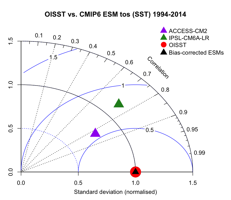
6 12.374546.3 Construct Taylor Diagram
Then, we plot our Taylor Diagram. Our OISST observations (i.e., reality) is the red circle. If our models perfectly represent reality, they should all plot on top of this circle. In this case, the raw ACCESS-CM2 historical run does OK at simulating reality, with a correlation of ~80%. IPSL does slightly worse at around 75%. However, the bias-corrected ensemble average of the two models (i.e., black triangle) plots directly on top of our observations, with almost a 1:1 correlation, meaning it does really well at simulating reality, at least for 1995-2014! Further, the bias-corrected ensemble mean has an improved RMSE (i.e., close to 0) and normalized standard deviation (i.e., 1).
This diagram demonstrates the sheer value of bias-correcting ESM outputs, before making projections.
Code
taylor.diagram(alldata$oisst_mean,
               alldata$oisst_mean,
               ref.sd = T, #display arc of ref. std. dev. (i.e., 1)
               normalize=TRUE, #normalize models so ref has SD of 1
               sd.arcs=TRUE,  #display arcs along SD axes
               pcex = 4,
               pch = 19,
               col = "red",
               xlab = "Standard deviation (normalised)",
               pos.cor = T, #show correlation (y-axis) from 0-1
               gamma.col = "blue", #RMSE arcs
               main="OISST vs. CMIP6 ESM tos (SST) 1995-2014")

# Add ESM points
taylor.diagram(alldata$oisst_mean,
               alldata$access_mean,
               add=TRUE, normalize=TRUE,
               pcex=3, pch=17, col= "purple")

taylor.diagram(alldata$oisst_mean,
               alldata$ipsl_mean,
               add=TRUE, normalize=TRUE,
               pcex=3, pch=17, col= "forestgreen")

# Add bias-corrected point
taylor.diagram(alldata$oisst_mean,
               alldata$access_bc_mean,
               add=TRUE, normalize=TRUE,
               pcex=2, pch=17, col= "black")


# Legend ------------------------------------------------------------------

legend(1.2, 1.7, cex=1, pt.cex=2, pch=17,
       legend=c("ACCESS-CM2", "IPSL-CM6A-LR"),
       col=c("purple", "forestgreen"),
       bty = "n")

legend(1.2, 1.54, cex=1, pt.cex=2, pch=19,
       legend=c("OISST"),
       col= 'red',
       bty = "n")
legend(1.2, 1.45, cex=1, pt.cex=2, pch=17,
       legend=c("Bias-corrected ESMs"),
       col= 'black',
       bty = "n")